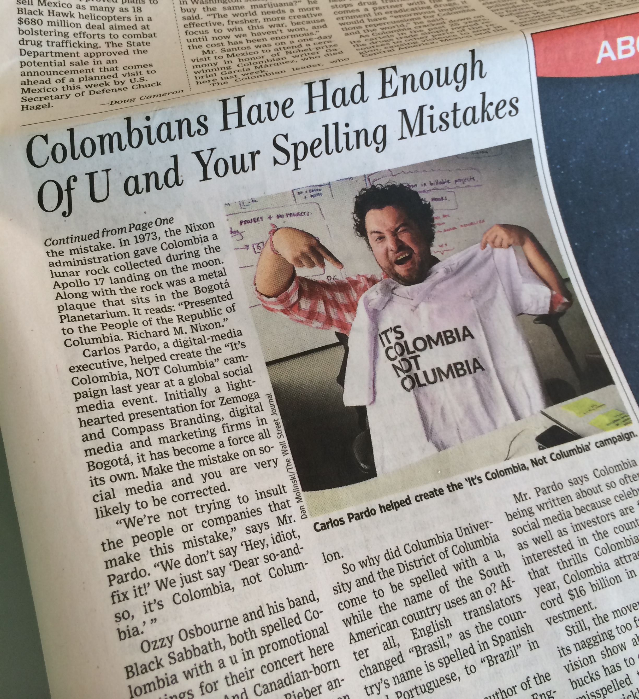
There are a few familiar faces in the Wall Street Journal today! On the front page, there is an article about the “It’s Colombia, Not Columbia” campaign and how it went viral.
There are a few familiar faces in the Wall Street Journal today! On the front page, there is an article about the “It’s Colombia, Not Columbia” campaign and how it went viral.

Back in the 1970s, Master Lee already laid down the basics of what the industry has dubbed responsive design. True interactive design experiences are like water: they take the form of the device you’re viewing them on, and in turn fully deliver the content and experience, regardless of that device.
Here’s the 101 of responsive web design: it is based around CSS, HTML, and fluid grids and images. Instead of looking at a website as a page, look at it as a system of modules that change in size and shape to fit the screen you’re viewing them on. Pretty simple. Right? Not so fast.
Like all things that last and remain effective…it must remain adaptive. That takes strategic thinking, not just fancy code.
We at Zemoga call that overarching awareness Adaptive Design. It’s why we take the approach as Experience Architects. Thinking through all the contextual nuance and options the user has, or desires… and then making them fluid, yeah…like water…and Bruce Lee. But it’s more than just responsive, because the thinking goes deeper than just knowing technologies like CSS, HTML5 and these fluid grids. It digs deeper. And sometimes to get the best water, you need to go deeper.
Responsive web design is the root of that adaptive experience and is the most effective way to ensure your users are receiving the most engaging experience, regardless of device. These experiences need to exists at the center, inside of a larger adaptive web design strategy. Much of what looks like responsive web design on the surface is really done through other, more strategic Adaptive Design strategies that come first.
When you’re designing a digital experience that is adaptive to the users’ consumption behaviors, you have to think about more than desktop and mobile. Your site and the content you deliver have to be frictionless on both, but it also has to function in every possible resolution in between.
And when SEO is critical, as it always is, having a responsive website is clutch. If your site has both a mobile version and a desktop version, they exist on two separate URLs. Your traffic is split between the two depending on the path. If your site is responsive, it uses the same URL for both mobile and desktop. In short, Google likes responsive web design, and so should you.
Responsive web design alone isn’t always the best option, though. If the user experience is substantially different between platforms, a mobile-dedicated site might be the best option. For example, subdomains that are expected to have short lifespans, such as contests or limited campaigns, would be suited for mobile-dedicated sites. Maybe you want to build a microsite targeted to mobile devices only: imagine touring a museum that has QR codes on various exhibits. The destination site would only ever be visited on a mobile device.
The shape of web development is always changing and you should always be aware of the shape your experiences are in. Our job is to distill our clients’ digital experiences down to their purest responsive form.
We’re always looking for new and interesting ways that responsive web design has been used. Here are a few examples of our responsive websites. Let us know your favorite uses of responsive web design in the comments below.

The Rolling Stone feature article “In the Belly of the Beast” is an adaptive experience across all devices. There were heaps of UX wizardry that went into it, so we decided to document and share the challenges faced and the technology used to deliver on it.
The video below shares our experience with it, and showcases the quality of the team behind the project! Please check it out below.
To check the live site, go directly to: http://www.rollingstone.com/feature/belly-beast-meat-factory-farms-animal-activists