We look at important considerations for global UX as it applies to launching OTT apps for different cultures worldwide.
Global UX: Localization for Your OTT App

We look at important considerations for global UX as it applies to launching OTT apps for different cultures worldwide.

To help businesses make sense of the changes over the last year, we’ve compiled our top tips for the future of UX Design and how to interact with digital users in 2021.
Leading up the Creative and Design teams, Juan Diego gives his perspective on how his teams made a shift to ensure the design process never suffered when losing whiteboards and in-person collaboration, and going 100% digital.
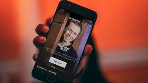
“Despacito” is the biggest latin pop hit since “The Macarena”. You may hate it or love it but it’s certainly a cross-cultural event worth looking at from different angles.
I still remember the days when prototyping used to be thought of as an add-on for projects. Building a prototype could be construed as difficult, demanding lots of “extra” work and force design teams to borrow resources from the technical teams very early in the process.
I’m not sure you had the chance to read Chad’s post a couple of weeks ago. If you haven’t please do. I’ll wait until you’re done, don’t worry. My post works on its own in case you’re short of time, but since it really is a follow up of what Chad wrote, I’d recommend to take a look at the thoughts he shared.
There’s skepticism around digital products created within digital agencies. One of the biggest challenges is that agencies have people working on multiple projects. Some people are not 100% dedicated to a single project but jump from one to another. There’s no problem with that, in fact, it may be done easily.
Native advertising, as with most of the buzzwords we hear and say everyday, everywhere, is a concept that is defined in so many different ways it’s just confusing. The “official” definition implies that every ad that fits naturally and feels like other types of content in the page fits perfectly into this category. The definition of the word “naturally” is very subjective, though. It’s as simple as this: the same ad in the same placement could feel more natural to some users than others.
The definition is so broad that it includes things like sponsored posts on Facebook or promoted posts on Twitter. The playbook created by IAB even mentions the inline ads you find between two paragraphs of an article you’re trying to read on your phone and it covers those recommendation widgets that are confusing to some users and just disappointing to others. It goes as far as to include paid search units.
I wouldn’t say those ads I’ve run into while scrolling through my timeline feel natural —although Facebook is doing a better job than Twitter at that. I can say I don’t trust those external articles you find contained in recommendation widgets at the end of an article you just read in ESPN —I trust ESPN as a content creator, however those “sponsored articles” are not being selected by ESPN but by the third-party that created the widget (Outbrain, Taboola, Earnify, etc). In the same way, most of the times when searching something on Google, I instinctively tend to prefer links that appear organically and ignore those that are clearly paid and promoted.

One thing you can say about the examples I mentioned above is that all those ads are displayed based on a certain context. Granted, that context can be more or less accurate depending on the kind of data it is built upon. But searching for “Cartagena Hotels” on Google, for example, shows me paid search results related with Cartagena, Colombia and not Cartagena, Spain. Google seems to figure out the context based on the search term and my location and then displays paid search results based on that, which is very smart. Recommendation widgets define the context by assuming you are interested in the topic you were reading about and then display article recommendations (from other publishers) related with that topic. I’m not going to go case by case, but one starts to see there is a common element in all these different ad solutions.
The common element is context. They try to address the consumer more accurately by using the data they have at hand, so you could definitely say they are getting smarter. The problem is that while they are smarter, they are still not adding much more value to the consumer’s experience. They are just being a better informed door to door salesman. Almost equally annoying.
Context alone is cool and it does increase the chances of getting to the right audiences in the right moments. However, the concept of native advertising covers other approaches that are pushing to make native ads more meaningful and valuable.
Buzzfeed’s revenue model is based almost entirely on sponsored articles. Ranging from 15 Of The Best Bands To Come From College Campuses (sponsored by Spotify) to the much less subtle 12 Ways Nutella® Makes You Smile (sponsored by Nutella), BuzzFeed has created what would be the perfect win-win scenario. Readers getting content that is entertaining and brands capitalizing by raising awareness and sponsoring content that is aligned with their attributes. However, the area of the layout of the article that says that this is a sponsored article is so small and subtle, a large group of users don’t see it and content passes as regular content, not as sponsored content, which gives room to all types of concerns.
Referring back to IAB and their Native Advertising Playbook, “In the world of native advertising execution, there is no limit to the possibilities when an advertiser and publisher work together on custom units”. That’s probably the most valuable bit of the entire document and makes one thing clear: key to success here is in collaboration. Advertisers and their agencies can (and should) be as creative as they want. Publishers are always open to trying new stuff as long as it is well paid. They kind of need to be open, to be honest. Custom native ads are probably the most expensive of the group, but they’re definitely the most impactful.

An example of this is the partnership between Netflix and The New York Times. The newspaper produced an in-depth piece on the conditions women face in American prisons and Netflix sponsored it by connecting the topic of the article with the theme of their series “Orange is the New Black”. The beauty of it is it doesn’t feel like a regular article of the newspaper’. The design was 100% custom and incorporated exclusive illustrations, in addition to the quality of the text content produced by the newspaper. The strategy was not to appear as a regular article and confuse. It was to reinforce the presence of the product by attaching to a special article on a related topic.

Custom content also means each case is different. This makes things more exciting for everyone involved: brand, publisher and agency. We personally had a lot of fun helping Rolling Stone and Wenner Media in their process of adding custom sponsored content to the products they offer to their super cool clients. In the case of Indian Motorcycles, the tie between motorcycles and rock music was reinforced by a custom article that was a highly visual list of the 40 most groundbreaking albums of all time. All the content was created by RS, and the brand appeared inserted into the story in the most organic way possible. The brand did fit very naturally in the story and both the design and the content of the article where in line with the magazine’s expected quality.
Especially when it comes to sponsored content, ethics are a big deal here and the more honest the brand messages feel and the less the publisher’s principles get compromised, the better for everyone, in the end. Publishers need to establish rules and filters and take care of their reputation. When it comes to deciding how far publishers can go for any given brand, there has to be a line that each publisher will have to draw according to their ethical values.
When I started to think about writing a piece on Apple Watch I was certain I would talk about the device from a rather skeptical angle. All the annoying buzz, added to the fact that I’ve not used a wristwatch in more than 15 years, had me very pessimistic about the success of this gadget. However, at some point last week, in the middle of the process of actually writing the article, I finally had the chance to really think it through and realize the potential of new, paradigm-breaking devices like this one.
Many out there are frustrated by the fact that Watch apps are not 100% standalone and depend (at least partially) on an iPhone. This is true because the technical architecture of this first generation of the Apple Watch is very limited in terms of how much load you can put on it. It also has to do with the purpose this kind of device is supposed to serve, from a strategic point of view.
It’s a companion device. It’s a peripheral to the CPU that is the iPhone. Think of it as a sidecar for a motorcycle, as a Robin for a Batman, as a Garfunkel for a Simon. [EDITOR’S NOTE: We have banned JDV from all future analogies]. You can either look at it as a very weak and limited companion or as a companion with special abilities.
Now, the question many are asking is: does the iPhone need a sidekick? Well, iPhones are great and recent versions are capable enough to edit video, stream audio and process 3D graphics at unbelievable speeds. However, they’re sometimes too much when all you need to do is check the time, read that Twitter mention, check the weather, see the score of your team’s game or find out the name of that song Pandora’s playing and maybe save it as a favorite. Reaching out to your pocket to pull out your phone and look at its bright giant screen when you’re with people not only sounds like a lot of effort, but also (and more importantly) it has a social cost —which is becoming more and more true with time. In the future you will want to remain connected, but will definitely prefer to be more discreet, if possible.
Does all this mean that every product should have a Watch companion? No. Like it happened with the inclusion of widgets in the notification center in recent versions of iOS, every other app rushed to conquer that special place of their users’ screen, but not many really had a reason to do it. For a product designer, this decision has to come from the users and what’s important to them. If that shiny feature you pushed into your users’ watches has no value in that context or is simply impossible to operate, those users will punish you by ignoring it, or worse.
We at Zemoga keep talking about user experiences and how these are larger than what happens within the limits of a screen of an app. Think of an experience as a huge flying spaghetti monster, with a bunch of tentacles that belong to the same creature, but extend to reach and connect to other undetermined places. This sounds complex because user experiences are complex.

Say you have a pretty iPhone app on the App Store. It’s never just about the app living as a standalone thing. Just take two minutes to think outside that box and visualize the entire experience around your users’ interaction with that app:
Asking yourself questions like these, talking with actual or potential users, mapping the entire experience are all good exercises in order to understand the user in a more holistic way and create an inventory of the many touchpoints where your product can provide value. Those touchpoints give you a better understanding of your users’ needs in different contexts and can be translated into opportunities to expand the functionality of your product to other devices like the Apple Watch.
Let’s think of an airline and their iPhone app, which probably offers all the functionality you would expect to find in a decent airline’s app: ability to book a flight, deals, information specific to your mileage program, an option to check-in, information about your flight, access to your boarding passes, etc. It looks like a very solid app, including all the basics and more.
Now let’s take a step back for a second and think about the experience of flying, which is full of touchpoints—moments in which the customer is interacting in any way with the airline and the experience of flying with that airline. The moment you get to the terminal and check-in, when you’re going through security, that block of time before you board the flight (maybe you go to the food court, maybe you ask an attendant for an upgrade, maybe you’re running from one terminal to another to catch a connecting flight), the moment you’re finally at the gate, the moment you’re about to board the plane, etc.
All these touchpoints are opportunities for our airline to add value through different devices according to whatever makes most sense: could we say, for example, that right after you’ve gone through security, your phone (the one you used to purchase your tickets) takes a backseat and your watch becomes your go-to device from that moment on?
We’re covering pretty much all the same functionalities you already had in this airline’s app, but now some of them are being distributed to the device that is most convenient for you in that context and in that moment. We’re improving your overall experience as a traveler, giving you extra reasons to choose this airline again the next time. We’re creating loyalty through user experience.
There’s a huge opportunity in creating experiences that live in this new device, but not every single idea will succeed. Product designers need to be smart and think of the entire experience their product can provide and, as always, find smart ways to distribute that experience among different devices (desktop, laptop, TV, tablet, phone, and now watch), thinking always about the relation between task, device capabilities and context.
As for the things you want your users doing on a Watch, it just requires a bit of common sense: asking Shazam to find the name of the song that’s playing in that bar? Yes, please! Buying plane tickets and booking hotels for that multi-city trip around Asia? Hmmm, maybe not yet.
“Wait, what? How could my employees watching the World Cup instead of working be a good thing?”
Well, to be fair, if you’re the boss, it probably wasn’t a good thing.

